The Analytics Dashboard gives you valuable insights into how students have engaged with their assignment directly inside of the LTI Inbox. These summary statistics provide another tool for you to use to help determine where to concentrate further investigation and learning development.
You can access the Dashboard from within a Turnitin Assignment and select the Analytics tab.

Submissions Timeline

The Submissions Timeline insight tracks submissions to your assignment and visually represents them. Each bar in this chart represents a day of received submissions. This insight gives you an understanding of when students engage with their assignments. It is particularly useful when you allow students to draft their work so you can see their engagement over time.
Red bars represent submissions that were uploaded after the due date of the assignment. You’ll only see them if ‘Allow late submissions’ is enabled.
Each submission is recorded as a unique event. If you have ‘Allow Resubmissions’ enabled, each upload is shown in the timeline.
Similarity Score

The Similarity Score insight shows where generated similarity reports fell within a similarity score range. The higher the bar, the more submissions that fell within that range. This insight provides an overview of the similarity score of all students providing extra context when grouped with others from the same class. Naturally, any scores that have fallen within the higher ranges are worth further investigation. However, large groupings of lower similarity scores could also indicate potential collusion.
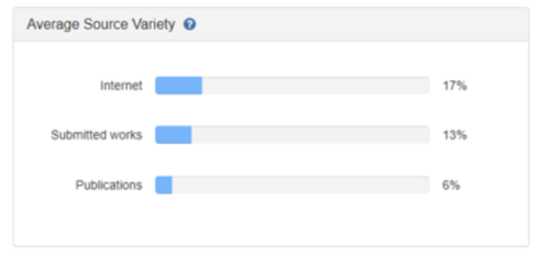
Average Source Variety

The Average source variety is a visual representation of the average similarity found for a source type across all submissions. This insight can be used to ensure that students are using a rich variety of sources in their papers.
For example, if one paper has a similarity score of 54% that are Internet sources and another has returned 76% then the average source variety for the assignment would be 65%.
Submissions

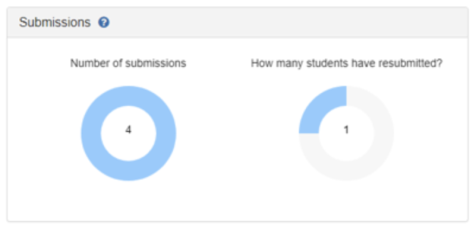
The two insights in this section give you an understanding of the status of your assignment and how many students have already submitted. If the numbers look low, that’s the perfect opportunity to give a reminder during class time of when the assignment is due.
- Number of submissions – The total number of submissions made to the class. Any empty area represents students who haven’t submitted yet.
- How many students have resubmitted – Of the students have submitted at least once, how many of them submitted multiple times.
Export Data
You can click on the Export All Data button at the top right of the screen and you will have all the Analytics downloaded within an Excel spreadsheet for you to view.
Refreshing the Data
Simply click on the refresh button next to the Updated: Date to get the most up to date results.

